Hi everyone!
Update: [2016/03/17] Fixed a bug where nothing was being shown on older versions of OSX
Update: [2016/03/10] The dev version has been updated! Download again to get the latest! 
We’ve just released FoldingText 2.2 (Dev) and it comes with a lot of fixes along with an exciting new feature: Outline View.
Outline View shows all headings and modes within a document for easy access. It also shows modes, so jumping to that todo list is now faster than ever. You can toggle its visibility it by using the menu View > Show Outline View (or Cmd-Alt-T).
Other updates include:
- Fix: Paddle registration issues
- Fix: Random crash on application startup
- Fix: Composition helper not showing up at cursor location
- Fix: Allow Alt-Space to enter Non-breaking Space within text
- Fix: Drag-drop not working
- Fix: Drag-drop links to url not pasting actual url Updated: [2016/03/10]
- Fix: Text becoming visually thinner near the bottom of the window Updated: [2016/03/10]
I hope you like this release. Please let us know if you encounter any issues.
Enjoy!
Regards,
Mutahhir
For the first time, it’s asking me about my license… I bought the AppStore version. How can I migrate?! Thanks.
It may just be that you need to download the Mac App Store version and run it once. Then try running the direct download version again.
If that doesn’t work please open Console.app and look for a message when launching FoldingText saying:
No recipe found at path “some path”
Do you see that, and if so can you send the path that is listed?
@mutahhir Great to see you pushing FoldingText forward. Nice work!
Let me preface this request with the the fact that if I’d implemented this feature I would have just included headings in the list, and from the feedback that I’ve seen people really like the modes feature. So nice work AND take my suggestions as just things to consider, because you are already making great decisions.
Anyway I think the feature overall is great. It helps expose FoldingText’s underlying feature set in a very simple way. My complaint is that I think visually the list text should either match the body text more closely (differing on just one attribute), or it should match the default system font styling for sidebar text. In the current styling it uses the same typeface as the body text, but different size, color, and linespacing. I think all that difference makes it not fit ideally into the rest of the UI.
Instead I think it would be better to pick just one attribute typeface, point size, color, or line height (or some other style, bold, italic, etc) and see how that looks.
Or alternatively you could copy the default OS X sidebar font style. Which different on lots of attributes, but matches the OS X style, so it is still expected and fits on.
Even if you decide not to do the above in the current styling I have a hard time picking out the different levels in the hierarchy. For example if I open the users guide it’s a bit hard to see the structure by glancing at the sidebar. I think increasing the indents or decreasing the line height (or both) would help in that respect.
Thanks @jessegrosjean for the kind words. Means a lot! All your input is always really valuable, and even if I depart from it (or you excercise restraint on some aspects ) it still makes me think about really common sense aspects to the design which improves the final result.
Regarding the sidebar, I think I agree with you. Let me do some tinkering with the design and see what sticks
Regards,
Mutahhir
That was it! Downloading the Mac AppStore version and running it (I think I had to create a new document since it didn’t seem to work the first time, but that could’ve been just my imagination) fixed the issue.
Thanks Jesse!
I like the idea of the outline view, but it needs work. The font is almost unreadable and the sidebar obscures part of the body.
I’ve attached a quick screen shot.
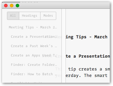
I agree with Philip about the obscurification of the body. This problem can be reproduced at any window width by configuring “Text Wrap Width” to “Wrap to Window”.
Hi guys,
Thanks for the feedback. I’ve already made modifications to make the outline view not overlap. Regarding readability, definitely something I’m working on
Regards,
Mutahhir
Hey All,
We’ve just posted an update to the 2.2 Dev version. Click on the link in the original post above to download again
I feel close to it being a release candidate. Do let me know if I missed anything.
Regards,
Mutahhir
What do others think of the way clicking on the outline heading in the new panel results in focusing on the clicked heading? Since this ability is already possible with the View>Focus menu command, I’d prefer if the clicking in the new outline panel scrolled to that heading, rather than focusing on it.
Hi Mutahhir,
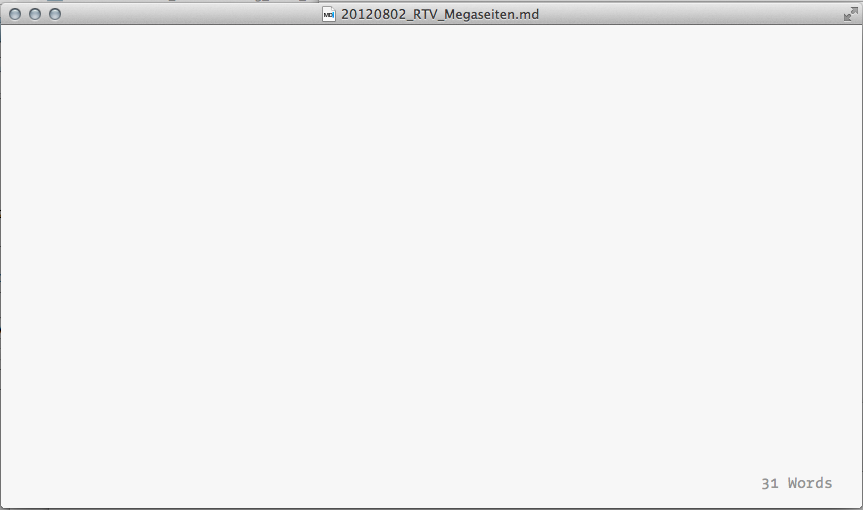
I told you at Twitter, my folding text 2.2-dev has no cursor, no Text will be displayed …
Now, i removed the plugin (Styled Tags.ftplugin), but i have the same problem …
With Version 2.1 i haven’t this problem …
I work on a MacBookPro Retina 12", Mac OS X 10.9.5 (2.9 Ghz i7, 8 GB)
Do you need more Details?
Regards,
Alex
Hi,
I can’t seem to reproduce this behavior. Can you give me the following information:
- Do you have any other plugins installed? Does uninstalling them help?
- What happens when you create a new document and start typing?
- Can you send me a sample file that you’re seeing this problem on?
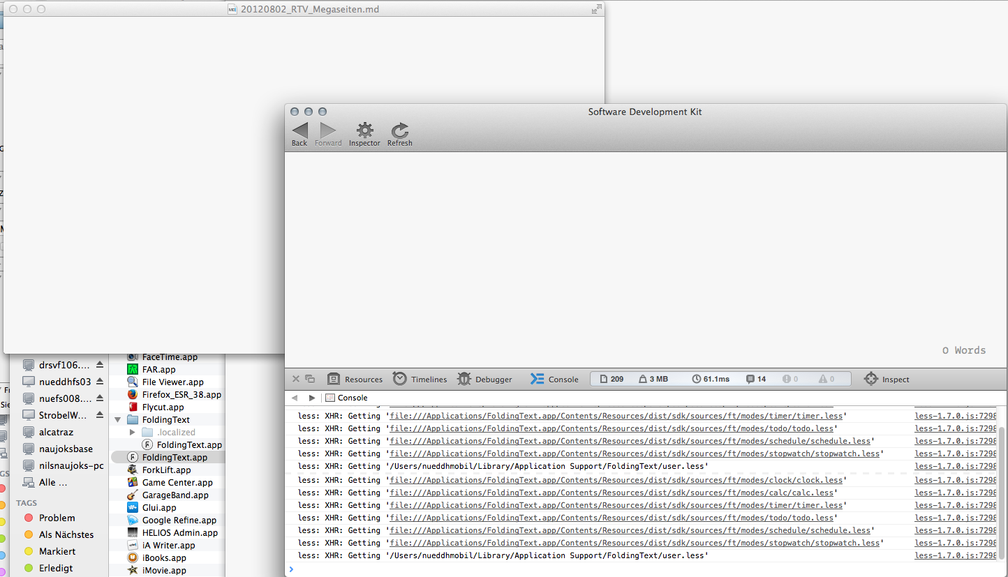
- Open the SDK (Help > Open Software Development Kit), click on ‘Run Editor’, then click ‘Inspector’ in toolbar. Paste text from a document that isn’t opening and send me a screenshot of any errors that show up in the Inspector’s Console (Click on Console Tab, and select ‘All’)
Thanks!
Regards,
Mutahhir
You see no text,
but the Counter shows you “31 Words”
I installed only one plugin “Styled Tags”. But I have the same problem without this plugin.
At the Console you see no errors
Ah, hmm. I think I know what the issue could be.
The version of WebKit that came on 10.9 doesn’t support flex box as I would have expected.
I’ll find out a work around and post another build that hopefully works for you.
Regards,
Mutahhir
I just wanted to add that I have the same problem as Alexander (no cursor, no ability to add text) with OSX 10.10. (Perhaps it works only in 10.11).
Thanks!
Sam
Likewise, I have the same issue on 10.10.
This also isn’t the first time this has happened. There was a prior dev release that did this and was subsequently corrected.
@Alexander @lewallen @ringmaster please download the 2.2 version again. The issue should be fixed now. Do let me know if it hasn’t.
Bravo pour cette version qui est confortable et agréable à l’usage.
Juste un point, ô mutahhir…!
In french : Dommage que toute insertion du pointeur dans une phrase, un mot pour une correction dans FoldingText commence nécessairement par une capitale…
In globish : Too bad all the insertion pointer in a sentence, a word for a correction in FoldingText necessarily begins with a Capital.
Voilà, c’est dit.
Autre point, si l’on pouvait choisir nos balises Markdown, cela me ferait également plaisir. Pour l’italique, je préfère des * à des _ !
Possible…?!!
I just discovered FoldingText a few days ago and I freaking love it. (Hat tip to the ATP podcast for the TaskPaper 3 recommendation.) It’s eveything I’ve always wanted for plain text productivity. I’m an academic (who programs on the side) and I live in my plaintext editor, so this is a big deal for me.
I thought I’d share some thoughts about the new outline view:
- First, this is really great idea. It looks really promising. Nice job!
- I’m not a big fan of using the system font for the outline sidebar when the sidebar isn’t always visually distinguished from the rest of the document. (Compare this to the always-gray sidebar for TaskPaper.) I actually really liked the font/UI from the original demo because it’s easier to keep the sidebar open without it being distracting. It’s less distracting because the font doesn’t clash and, more importantly, the outline is ‘dimmed’. If visibility is the concern, you could maybe try making the text darken when hovering over any part of the sidebar?
- Another thing I liked about the original demo UI: the main text remained centered in the larger window. I’m not sure why, but a centered column of text always looks cleaner/more balanced to my eyes.
- Have you considered adding a clickable outline/hamburger toggle? I can see points for and against this. I’d prefer some toggle that didn’t ‘highlight’, so that, again, the high-contrast object doesn’t distract from the main text. I was imagining a button that toggles between an outline icon and a ‘back’ chevron. Do people like this idea? Thoughts?
- A small nitpick: I don’t love how the all/headings/modes button group is misaligned with the outline text. It just looks out of place. If others agree, a couple options that came to mind: a) you could left-align the panel as it currently is, or b) have an auto-width container, split into thirds, with centered text for each of all/headings/modes.
I hope that’s helpful!
P.S. I like working on front-end UI. I’d be happy to divert some of my programming hobby time to work on mockups for this/future features.